I walked up to the newspaper stand inside the door of my local Albertsons to find a selection of 6 different papers varying from local news to national: The Gazette Times, The Oregonian, The Albany Democrat-Herald, The New York Times, USA Today, and Register Guard. Led by instinct, I picked up the paper with the front page displaying large pictures of fire, protesters and mob lines in Yemen, Bahrain and Iran, all featured in full color. The New York Times won my business with their eye catching pictures and big headlines. Scanning the front page, it is noticeable that this paper is designated to inform on the politics and large-scale happenings throughout the US and around the world with cover stories regarding US President Obama’s budget updates, protests throughout the Middle East and the revolution in Egypt.
The NY Times print edition is divided into topic-based sections with “key interest” articles positioned closest to the front of their respective sections with shorter stories deemed “less urgent” in the middle and back. This formula isn’t unique to the NYT but is a standard practice for most all newspapers. I think it would be safe to say that the succession of articles has a general pattern of lengthy articles starting in the main section (followed in second place by the Business Day section) with brief introductions and continuations later in the paper followed by sorter articles in the specialized interest sections such as The Arts and Science Times (which are also considerably thinner sections in comparison to the front/main section of international and nation news and the business section).
An aesthetic observation that I am slightly confused on is the choice of coloration. It seems uniform that the cover pages of the individual sections are in color while the inner pages are printed in black and white. Flipping through the pages however, I find seemingly random pages in color. Some of these pages are full page spreads of ads while others are article based pages with color photos. Speaking of ads, this poor paper is utterly swarming with ads. The products advertised however are less intended for the poor with brand names such as Chanel, Gucci, Dior, and Tiffany & Co. all found on pages A2 and A3.
The ads presented online however are in far less abundance. This could be accredited to the slide show effect of the advertisements allowing for more ads to be cycled through a designated space while not littering the entire page them. The nytimes.com does provide a handful of the same stories as the print edition but there is a clear distinction between the amounts of articles featured in length online in comparison to those printed. In my opinion though, the nytimes.com displays their ads in a manner that is visually far less sophisticated than the spread of the print edition. Online, the paper provides many links to lead the reader to the different stories where more information can then be acquired but on the main page there is actually very little article content but mostly links, small photos, and video news clips. In contrast, the print version of NYT is very rich with articles although there are sections dense with advertisements. The clear edge that the nytimes.com has over the NYT print edition is the timely posting of stories. As I sit writing this, the stories printed on the stack of paper next to me are not changing while the nytimes.com page after refreshment is revamped with new stories posted 32 minutes ago.
A strength that can be pointed out for the nytimes.com edition is the ability to update continuously with journalists able to post their stories as they finish as opposed to the short coming of print editions once having printed, there is no room for additions or changes, just future stories or continuations waiting to be printed in the next day’s edition. A second strength that the online NYT has is the endless amount of space available rather than the short coming faced by print editors of needing to fit a certain piece into the puzzle arrangement of the printed papers. On the flip side of things, the printed format of the NYT has the advantage of appearance of sophistication and easy navigation where as online the endless procession of links can be overwhelming and loses the high-end feel that the print edition has. A second strength that the print edition has and a shortcoming of online papers is the tradition of a newspaper. Though we are heading into an age of technology where digital is preferred, the printed paper holds dear memories for many that still receive the paper for the purpose of continuing the routine starting generations back.
 With high end ads and politically driven interest pieces, it is safe to say the primary target audience is generally well educated business types who have money to be tempted by ads proposing they fly to the Caribbean and stay at the glamorous Atlantis casino. That statement in and of itself is a stereotype but I would say that is as far as they go for this paper. The New York Times knows how to accommodate their desired audiences by providing a plethora of venues for exploration for the more modern, technology appreciative customer and the tradition news source for the generation of traditional morning paper and coffee.
My personal preference between the two options would be the printed edition. I like the layout and having the paper in my hands. I find myself so distracted while reading publications online that I rarely finish an article much less explore and read more articles at length. Plus I enjoy the puzzles that the printed editions always slip in there; both the Sudoku and the Crosswords are fun! The online editions also have interactive qualities such as areas where you can rate or vote for or against a topic as well as link to Facebook and Twitter. All the while, I found doing these comparisons between New York Times print and .com there are so many features available to me and also how much I truly do enjoy time to just sit and read which feels like a rarity in an age of constant tasks and jobs.
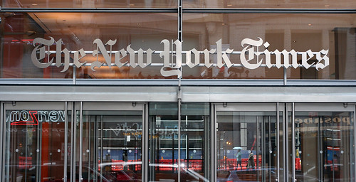
New York Times Building Front Photo compliments of Niall Kennedy
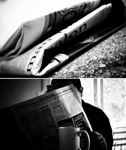
Coffee and Morning Paper Photo compliments of Juli Shannon


No comments:
Post a Comment